
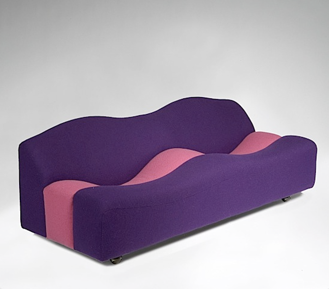
Ce glissement n’est pas anodin. Il reflète un rapport au monde plus prudent, plus normé, parfois plus anxieux. Une forme de retenue visuelle qui accompagne d’autres transformations culturelles. Car au même moment, la culture populaire raconte une histoire similaire.
Des recherches scientifiques portant sur des corpus de centaines de milliers de chansons révèlent une évolution marquée de la musique pop depuis vingt à cinquante ans : tempos plus lents, tonalités plus sombres, paroles plus introspectives. La pop s’est faite plus mélancolique, plus intérieure, moins collective.
Ces signaux, mis bout à bout, dessinent le portrait d’une époque.
Quand le design portait une vision collective
À l’inverse, le mobilier d’après-guerre — celui que l’on regroupe aujourd’hui sous le terme de design du XXᵉ siècle — était rarement neutre. Il portait une ambition claire : reconstruire, améliorer le quotidien, inventer de nouvelles façons de vivre ensemble.
Les designers de cette période ne dessinaient pas simplement des objets. Ils formulaient des réponses sociales, culturelles, parfois politiques.
La couleur y occupait une place essentielle. Non comme un effet décoratif, mais comme un langage. Elle exprimait l’optimisme, la confiance dans le progrès, le désir de rendre la modernité accessible et désirable. Cette logique dépassait le mobilier.
Par exemple, lors du lancement de la Renault Twingo, au début des années 1990, la voiture se décline dans une palette de couleurs vives, accompagnée d’un slogan devenu emblématique : « Inventez vous la vie qui va avec ». Une invitation claire à projeter un mode de vie, une liberté, une identité.
L’objet comme formateur du regard
Si l’on admet que l’architecture influence nos comportements sociaux — ce que défendent sociologues, urbanistes et designers depuis plusieurs décennies — alors nos intérieurs jouent eux aussi un rôle fondamental.
Se meubler n’est jamais un acte neutre. Ce n’est pas seulement rechercher le confort d’un fauteuil ou la fonctionnalité d’une table. C’est faire entrer chez soi des formes, des matières et des couleurs qui influencent notre perception du quotidien. Le design du XXᵉ siècle portait cette ambition : ouvrir le regard, susciter l’émotion, provoquer parfois l’étonnement ou la réflexion.
Des designers comme Pierre Paulin, Kho Liang Ie ou Charles et Ray Eames ont travaillé la couleur comme un véritable outil de recherche émotionnelle. Elle n’était ni gratuite ni arbitraire. Elle servait à capter l’attention, à créer un rapport sensible à l’objet, à inviter à l’usage.
D’autres, comme Ettore Sottsass, ont poussé cette logique encore plus loin. Couleur, matière et forme devenaient des moyens de questionner nos habitudes, nos normes, nos zones de confort. Le design cessait d’être discret pour devenir volontairement expressif.
Authenticité, restauration et responsabilité
Chez Undesignable, nous défendons une idée simple mais exigeante : L’authenticité ne se limite pas à une époque ou à une signature. Elle passe aussi par le respect de l’intention des designers.
Restaurer un meuble ne consiste pas à l’aseptiser ou à le neutraliser pour le faire correspondre aux tendances actuelles. C’est, au contraire, préserver ce qu’il raconte : une époque, une vision, une manière d’habiter le monde.
Respecter le travail de Pierre Paulin, par exemple, implique d’assumer la couleur — notamment lorsqu’il s’agit des séries éditées par Artifort. La couleur fait partie intégrante du projet. La gommer, c’est en altérer le sens.
Dans un monde qui tend vers l’uniformité visuelle, choisir le design historique, la couleur et l’authenticité devient un acte culturel. Un acte de transmission.
Parce que le monde de demain appartient à nos enfants et à nos petits-enfants, il nous revient aujourd’hui la responsabilité de façonner des intérieurs qui ouvrent le regard, stimulent la curiosité et rappellent que les objets peuvent — et doivent — porter du sens.
En savoir plus ?
« Une étude anglaise constate qu’aujourd’hui près de la moitié des objets analysés présentent des tons neutres, contre seulement 15 % au XIXᵉ siècle. ».
Lien : https://www.rtbf.be/article/vers-un-monde-grisatre-pourquoi-la-couleur-disparait-elle-de-nos-environnements-et-interieurs-11390478?utm_source=chatgpt.com
“Trends in Popular Music Lyrics: A Computational Analysis”, 2019, Université de Californie + Université de Bristol